1 dec 2014, last update: 30 Jan 2022
User friendly developing with the Sitecore Experience Editor
Sitecore is an ideal product to manage complex websites. For the less technical CMS editors Sitecore has an old Unique Selling Point the great page editor now called The Experience Editor. When using placeholders and component the Experience editor make it possible to add component on a user friendly way.
Sitecore has a Guide to Building for the Page Editor and Improving the Editor Experience. See Page Editor Recommended Practices for Developers
When develop on the right way, by using the correct controls or for MVC Editable methods out of the box the page editor is working. In this article we describe how to use the page editor features in order to make it for the editor extra user-friendly. Most screenshot taken with Sitecore 8 technical preview but everything should work from Siteore 6.5 and higher.
First you need to know about general User friendly developing in Sitecore. See Part1 of User friendly developing with Sitecore. And understand the placeholder component model.
Nick Wesselman has an old but very good video it is for Sitecore 6.5 so some of the old issues are already resolved: Sitecore Page Editor Unleashed
Placeholder settings
Of course you need a placeholder setting item for each placeholder with the allowed controls and the edit on.
Experience Buttons
An experience button is an extra button in the context toolbar. Out of the box there are buttons for Insert , Delete, Move Up, Move Down. And if you use Web Forms for Marketers a Edit Form.
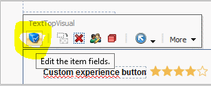
Custom Experience Button
For example you need an extra button for the fields that are not editable in the page editor.
First you add your button in the core database \Applications\WebEdit\Custom Experience Buttons.
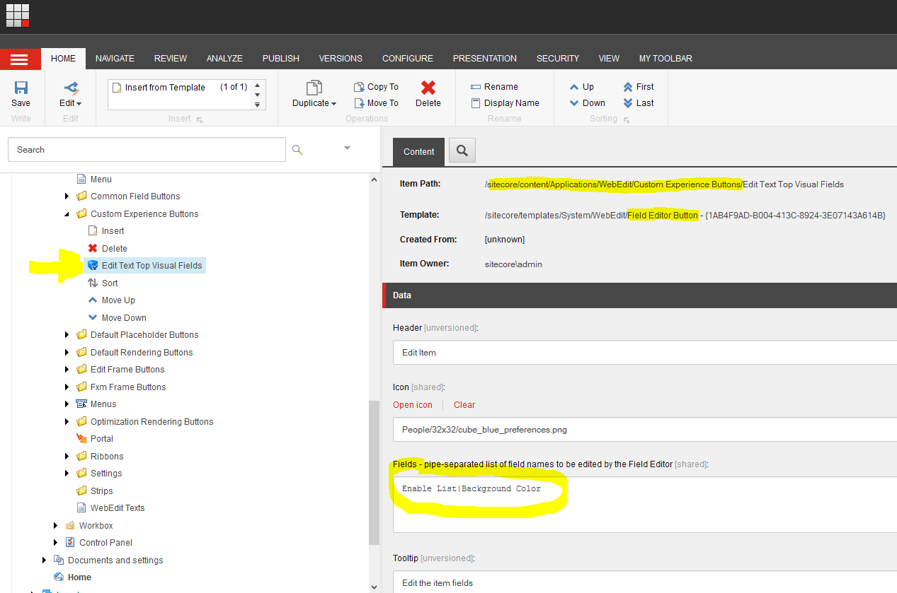
And fill in the Fields you want to edit. Now is this button is selectable in the Sublayouts located below /sitecore/layout/Sublayouts
Field "Page Editor Buttons" in the master database.
Edit Frame Buttons
An Edit Frame Buttons is for adding a context toolbar with custom buttons in a non-editable section. Typically most time you can use a Custom Experience Button. You can use the<sc:EditFrame …> control. Or for MVC see How to use EditFrame in Sitecore MVC
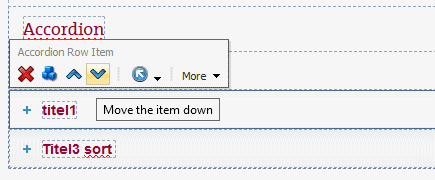
Example for Insert and Sort with Custom Experience Buttons and Edit frame
For Example if you have an Accordion, you create an Accordion rendering, with a data source and insert options for an accordion row and add the “Add” Custom Experience Button.
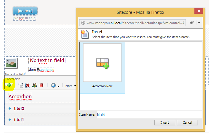
The Accordion component gets all the Accordion row children and display them. Each accordion row has an EditFrame with sort buttons and a Edit accordion row Fields button.
Layout component visuals
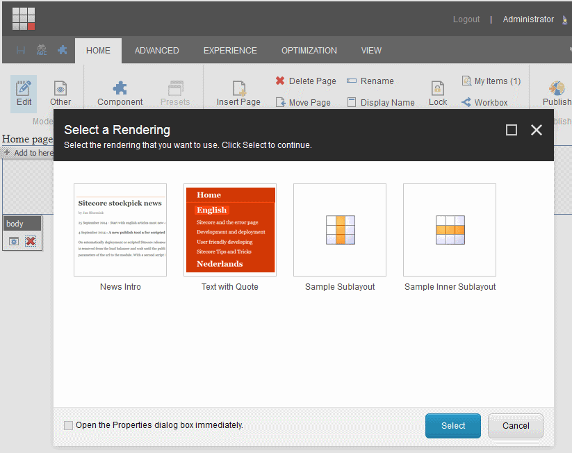
At a Sublayout and rendering you can add a Thumbnail in the Appearance section, this visual is used instead of the icon in the page editor when adding a component
Adding Experience editor ribbon buttons
You can also add custom buttons to the ribbon, for Example a Publish button for a specific item, the Shared Components item.
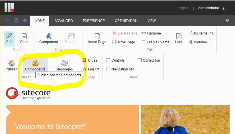
This ribbon sections with buttons are defined in the core database below /sitecore/content/Applications/WebEdit/Ribbons/WebEdit/Page Editor
Note: In the latest version the Page Editor Node has a display name “Experience Editor”
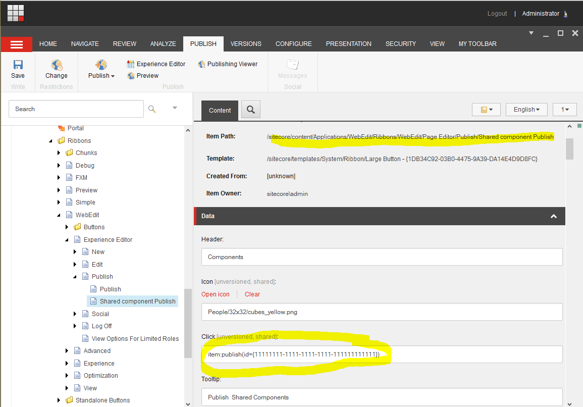
Fill in the Guid for the node to publish.
Adding help text
It's hard to understand what does everything in your special template and which components you need and how to configure.
In order to make it truly user friendly, it is necessary to add help text editor in the page, at the time that it become somewhat more complex. Even if you have added a custom button, it is wise to make that clear with a help text.
Sitecore has no field for a help text in the experience editor but it is very easy to do by simply putting a div that is visible in the experience editor and invisible beyond.
if (Sitecore.Context.PageMode.IsPageEditor)
{
  PageEditorDiv.Visible = true;
}
Compatible rendering
With compatible rendering you can change the rendering or layout from a component the new rendering use the same datasource if there is a data source. This feature is active when there are Compatible Renderings filled in in the rendering/layout and the are allowed in the placeholder.
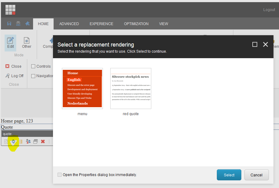
See improving the page editor experience part 4 using placeholder overrides to change availability of compatible renderings
Limitations
A placeholder key must be unique. This means it is not a good idea to create component with a placeholder. But is you need a component with a placeholder you can use a Dynamic Placeholder Key see Dynamic Placeholder Keys Prototype